The basic premise of ‘wayfinding’ is simple enough – navigating our way from one place to another! We all do it every day by using accumulated knowledge, memory and previous experience to get from where we are, to where we want to be.
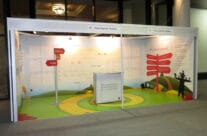
Wayfinding signage is designed to inform people in an unfamiliar environment, so that they may successfully navigate the space they are working within. Effective wayfinding signage design is based on appealing to the human behaviour and habits we have in navigating naturally.
Here are some aspects to consider when designing wayfinding signs:
Wayfinding principles
- Don’t force the person to think! Produce a clear and concise visual communication instructing the person directly of their surroundings and where they need to go next.
- Give only necessary information – detail what is relevant to the space they currently occupy, their current location and the navigation path required to get them to the next location. Any extra detail can only potentially confuse the matter and is not necessary.
Wayfinding design
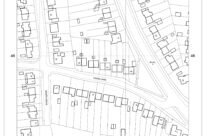
Wayfinding signs must convey a logical and modular system, or path, that adapts to the immediate and relevant environment, to be recognised, and interpreted, by the human facets of orientation and navigation. To be fully effective, it is necessary to research the build environment and, therefore, establish the most effective placements of the signage.
Wayfinding signage
When considering your sign printing requirements, there are three important types of informational signs to include – these are:
Directional signs
Displays information about, and direction to, the relevant destinations. These should be located and displayed at several strategic points along ‘the route’.
Identification signs
These signs should display information about the individual, specific locations in their actual situation.
Warning signs
These signs should indicate safety procedures, and any relevant warnings as to aspects within that vicinity – such as fire escapes, no smoking areas and behavioural restrictions or requirements.
It is worth noting that using multiple signs with individual instruction or information, is more effective that using fewer signs displaying multiple instruction or direction.
Signage typeface
You should choose an easy-to-read font for any wayfinding signage text. The text should be legible with large height characters and wide letter proportions. It should include positive letter spacing to enhance the visual message, and display simple and concise instruction.
Summary
Wayfinding sign printing and design should be consistent in its appearance and content – use the same sized-lettering and typography throughout all the signs, and display information in the same order consistently.
John E Wright
John E Wright’s fully trained fitting staff can help transform your vehicle into something really unique. Whether you’re looking for a full wrap, help to re-brand your fleet or some removable magnetic signs, John E Wright can help your vehicle become more than just a mode of transport – it’s the next step in your marketing plan. Get in touch and tell us about your requirements, or upload your design directly to our printers through our website. It’s so easy, and you’d be surprised at how cost effective it can be.


